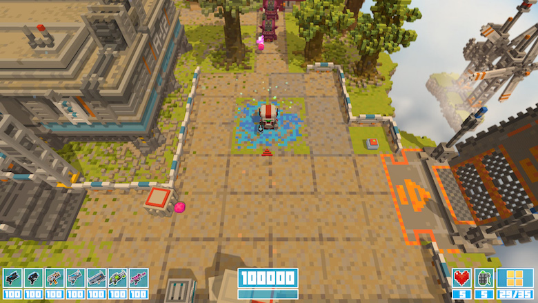
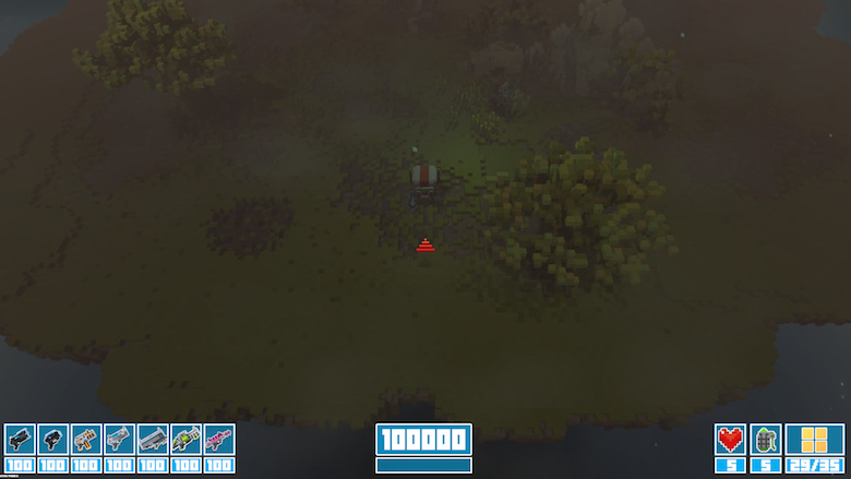
One of the elements we’ve iterated on the most in Smith and Winston has been the HUD. It really is hard to convey all the information in a quick and timely manner to the player. This is especially true for a game with as fast action as Smith and Winston. Here is out latest revision.

Designing it so that it worked in both light and dark scenarios was also a challenge.

It really feel like it’s starting to come together now though so that’s good.

Comments